New UI Updates – June 14th, 2024
We’ve made a few minor layout changes to the admin console this week:
We’ve introduced a ‘Clear Search’ state when you’ve initiated a record search. Previously this would show a [Clear Search] button. How it works now is before you initiate your search the search icon only appears as a magnifying glass icon like this:

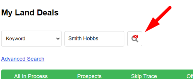
Once you click the search icon and initiate your search, you will notice now that the icon and mode of the option change into a clear search option that looks like this:

Click this clear search icon (magnifying glass with a red X) to clear/reset your search.
The next update we did was regarding the placement of our main options under the Land, Houses, Marketing, Notes, and Task areas. We moved these options from the center of the screen to the top right:

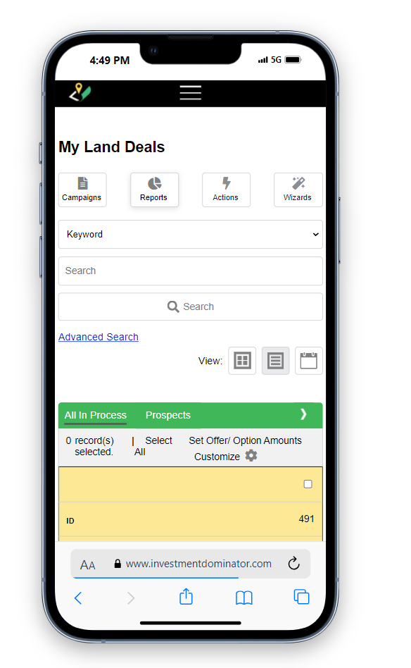
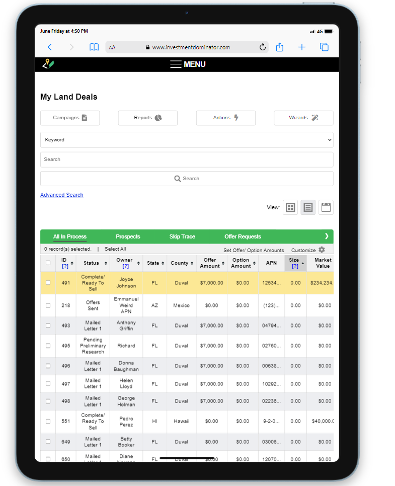
While this may seem like a small change it improved how the system displays on tablets and mobile devices:


